How to Build a Website for Your Small Business (with a checklist)
Table of Contents
Listen to this episode 🎧
Rules for building a website that converts | 018
Building a Website for Your Business: Simple Steps That Work
Building a website for your business doesn’t have to be overwhelming. Learn when and how to create a website that is easy to use and grows with your needs, from choosing colors and fonts to selecting the right platform for your business type.
📥 Download This for Later ➔ Website Build Checklist
Getting Started
Last week, a member of the group asked how to get started with a website for her farm. She had a few requirements:
It should be easy to build (she's not very technical).
It should be affordable.
It should allow for future growth, like adding products or forms later.
✏️ Note: That last point is crucial as a business grows
I’ve been building websites for almost 10 years, so I can help you avoid common mistakes. If you don’t know what HTML, CSS, or JavaScript are, this guide will get you started. These steps are based on my experience in marketing and sales and are written simply so anyone can follow them.
Picking Colors and Fonts
I’m not a designer, but I’ve learned that using too many colors or fonts can make a website look messy and hard to read. If you’re not sure what to use, keep things simple.
Until you feel confident, here are a few basic rules.
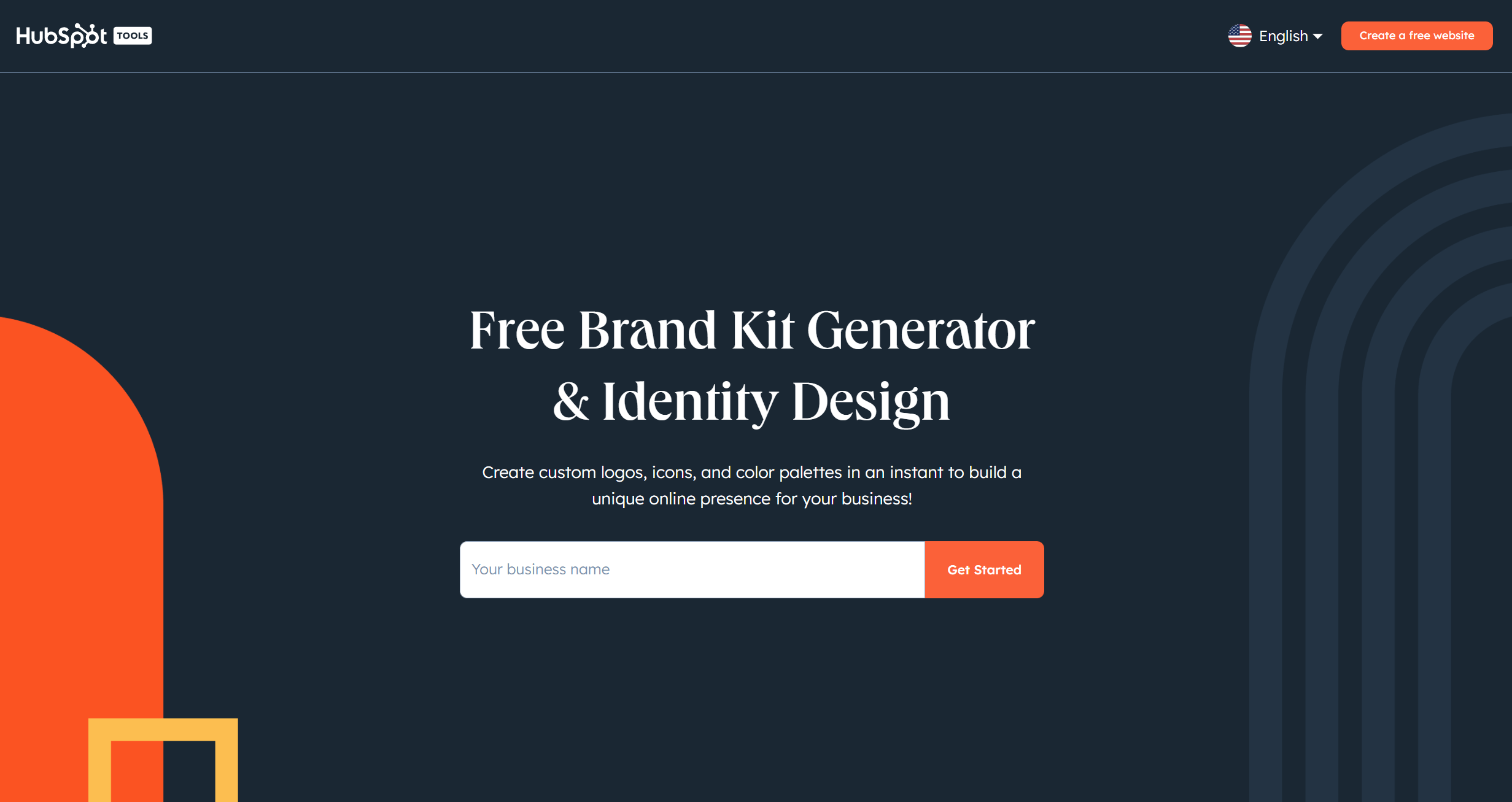
I recommend using the HubSpot Brand Kit Generator. It’s free and will create a color set, fonts, and even logos that all work well to get you started.
Colors
Basic Color Rules:
- Use 1 or 2 colors only.
- Use a white background.
- Use black text.
- Choose one color for buttons or areas people should click.
Almost any one color will look fine with black and white. Use white for the background, black for text, and the extra color only for important places you want people to click.
💡 Tip
The easiest way to make a website look better is to remove things you don’t need. Only add things if they’re really necessary.
Fonts
Basic Font Rules:
- Use 1 or 2 fonts only.
- Use sans-serif fonts (simple, easy-to-read fonts like the ones below).
- Keep body text (the main writing) at 14-16 pixels.
- Keep headings between 28-40 pixels.
Unless you are a designer, don’t choose anything too fancy. Above all else, your website’s job is to be clear and easy to understand.
Here are a few good fonts that you’ll find on most website builders:
If you’re unsure, just pick one from this list that’s available on your website builder.
Planning Your Pages and Content
Every website should have a homepage, and it’s a good idea to have a contact or booking page too. Here’s a simple breakdown of pages that are important:
Must-Have Pages
- Homepage - This is where visitors land when they type in your website address.
- Contact or Booking Page - Even if it’s simple, having a way for people to reach you is helpful.
Homepage Layout
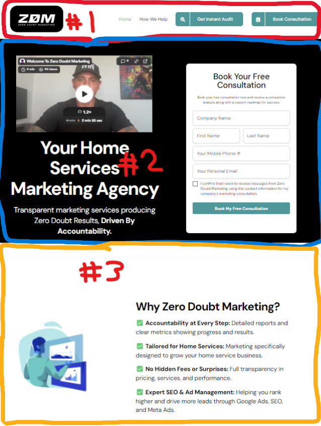
The homepage has four main parts:
- Heading/Menu - Links to other pages, usually at the top.
- Hero Section - The first area below the menu. It lets people know they’re in the right place.
- Body - The main content area. This is where you explain what you offer and how it benefits visitors.
- Footer - (Optional) This area at the bottom can have contact info and links to other pages.
For an example, here is the homepage for ZeroDoubtMarketing.com They are using a very simple layout, that gets the correct information across immediately and efficiently.
Platforms Worth Considering
Choosing the right platform is crucial for long-term success. When I was building 1023 Diesel we migrated or website 5 times in 6 years and it was a nightmare every time. The problem always came down to not understanding what we needed, and what we didn't.
Here are some options I would recommend checking out, depending on how you intend to use the website.
Basic Websites
If you need a simple website, Wix or Weebly are good choices. They’re both easy to use and don't require coding skills. They have free versions, but paid plans give you more features.
Both are able to expand with plugins for contact forms, small eCommerce shops and other widgets like maps.
If you just need a basic website, your skill level is low for building them and your budget is small, these are the platforms I would consider.
A Little More Complex
If you want more customization, Squarespace is a good option. It offers flexible design choices, but with flexibility comes added cost and complexity.
Squarespace has all the basic features and functionality of Wix or Weebly, but with a lot more grunt. It has a more robust cart (for eCommerce) and offers dedicated ability to manage things like subscription products with paid tiers of access.
Dedicated Ecommerce (50+ Products)
If your primary focus is selling products online and don't want to rely on marketplaces like Amazon or Etsy, Shopify would be my choice.
I attempted to use Shopify for our automotive eCommerce side back in 2019 and it was rough. The platform had such a great start but for highly complex things like autoparts it didn't work for us. Now though, it excels.
Nearly all of the shops that were our size or bogger have moved to Shopify and absolutely love it.
If you want an eCommerce platform for 50+ products, Shopify would be my go-to.
Newsletter / Blog Hybrid
This venture into the newsletter/blog hybrid thing has taught me a valuable lesson. It really sucks writing content then having to edit for two platforms.
It's time consuming and painful and frustrating. Thankfully, there are some really good solutions for this that incorporate your own website (unlike like Substack)
Here are two notable products that fix this issue and were purpose built to solve it.
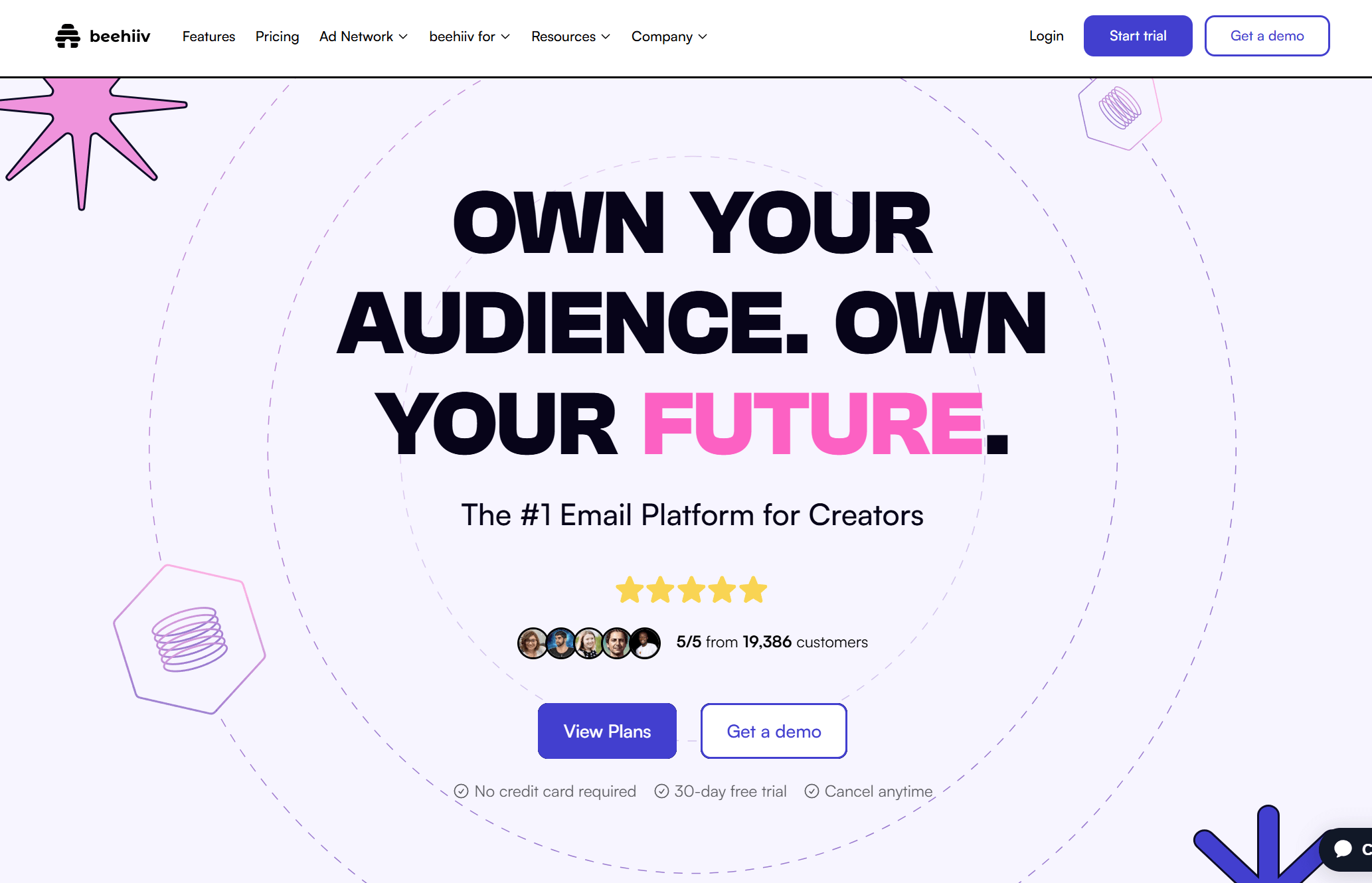
Beehiiv
Ghost
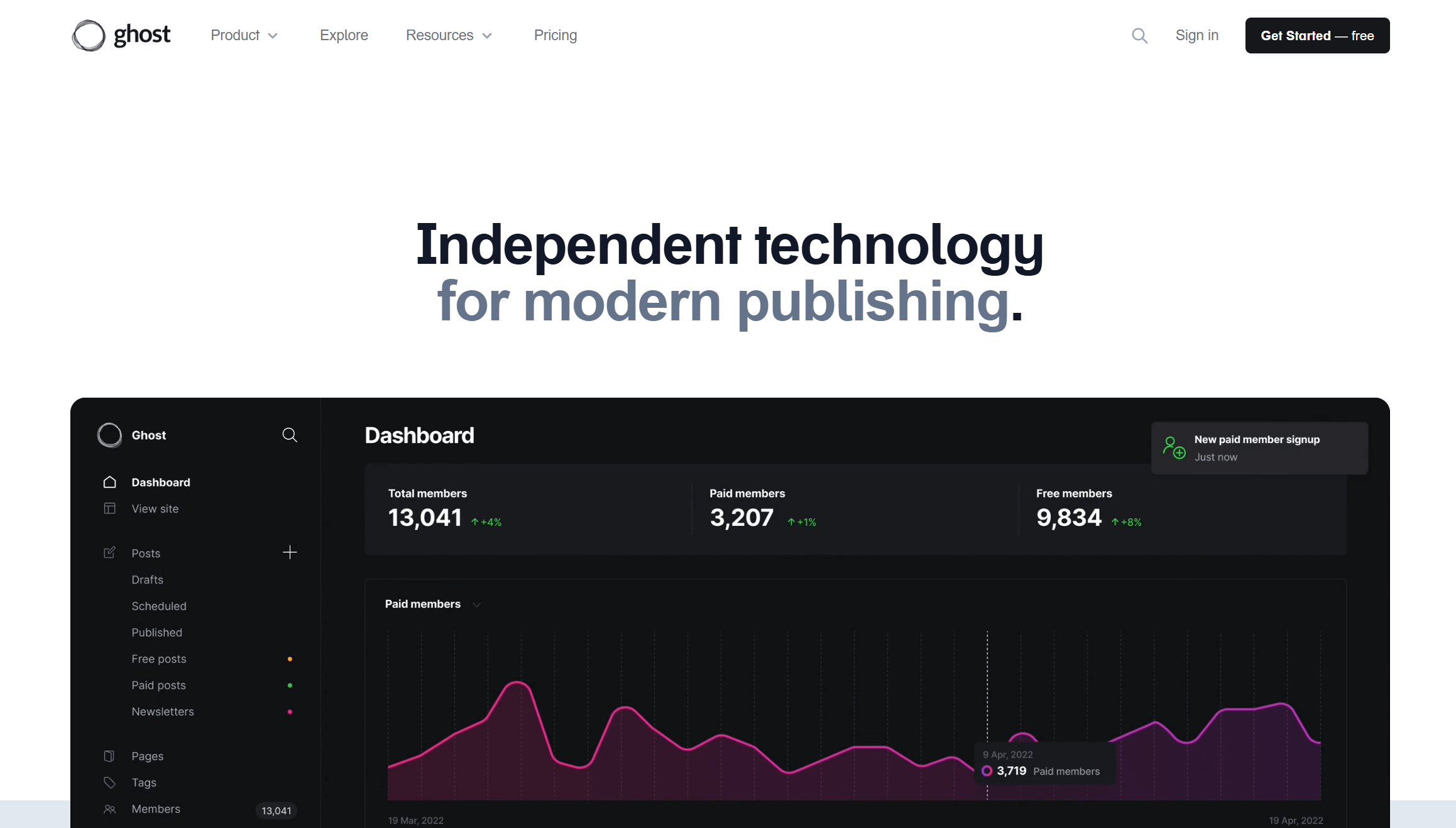
These platforms are incredible for creators who publish to website and email like I do because of their all-in-one editor and publishing tools.
Write once, publish everywhere - that's the idea anyway.
When I do a full writeup on this I'll like it here. There is some definite nuance to choosing the best one.
Notable Mention
I'll throw this in as a contender because it is affordable and will work for a lot of small business. mailerlite.com is what I use for my current business website. The website builder is great (no code) and I care about email marketing which is fully integrated.
